The best thing about email design is that you live your designer persona even if you have the minimum background in graphic design. Designing emails can be one of the simplest processes in email marketing when following few simple tips -that we’re here to give you-.
Your email design is surely the first impression you give to your recipient, before reading your email, your recipient opens it and decides whether it’s worth the time they would potentially spend reading it, and you want them to be compelled, mesmerized and hypnotized to read it, and even take action.
A good email marketer uses every element in their email from their subject line, to their signature in order to seduce their reader, and the design of your email might be the most crucial part of the process. Unlike personal email accounts (like Gmail, Yahoo, or AOL) email marketing services help you bring your creativity and genius to make your email look fabulous.
Today we’re giving you the tips you need to create gorgeous emails that would compel your reader to take action.
Make sure your email is:
-
Responsive and scalable design:
The most hideous design error that you could commit is a non responsive design. I was once with a friend who’s kind of an expert in web design, I asked her about her opinion on a website and believe me the very first thing she did was minimizing the browser and then dragging it from right side to left, and then she was like “ok first test passed”. So now you know what you should do before thinking about your sexy font.
-
Designed for mobile
53% of emails are opened on mobile phones, more than half of all the email sent daily, do you realize!! So you obviously guessed what that means. A mobile friendly email is a must, no excuses. You can find some of the best mobile friendly templates and design tools in MailChimp’s article Mobile email templates and mobile design tools.
For mobile design, you can either create emails that resize to fit the small screens, but this option is only applicable to very simple and basic designs. Or better than the first option, you create responsive email designs that adapt to any screen size, which on the other hand could be complicated to code. You chose the option that suits you the best.
-
Specific email for specific purposes ( Newsletter – marketing …)
Third most important thing is creating email designs adequate to their purpose. Yes yes a Newsletter email doesn’t look like a sales email.
Newsletter Email:
Your Newsletter email has one simple objective, is to make your reader click on whatever link you’re attaching. You want to make that call to action look so simple and easy that your reader can’t decline.
So start by inserting very short text, easy to read, clear paragraphs that your reader would just need to skim to get the message, remember your recipient has so many more emails similar to yours, so don’t waste their time. Insert a large image that clearly conveys your message, and obviously a call to Read More button that one cannot miss. You’d want to use clear and big font that are easy to read, break your email into different sections, and white space is your friend.
And of course don’t forget including link to your website, and social media buttons.
Sales Email:
Most of the Newsletter email features would still apply here, like the clear fonts, the links to your hosting website and your social media. You want your message to be clear and concise, don’t overwhelm your reader with unnecessary details, give them just what would trigger their curiosity to look for more details maybe on your website.
Here your objective is more demanding than a simple newsletter emails, you want your reader to take a serious action, to pay actual money. So you should spend more time on crafting your one paragraph, but still make it short and to the point. Use an image that conveys what the deal or offer is. And finally a smart call to action button, be creative, you don’t wanna use regular call to action buttons text, after all that is the last thing that sets your reader’s decision of clicking or not. Yet, make sure to have a single call to action button, a straight and forward one.
Welcome email
The most important thing to remember about your welcome email is that your audience does not know much about your business; don’t assume that they do! A welcome email should include a welcome message (obviously) and also some -but not too much- information about your business, product, or service, just enough information.
Include images that represent your business, and of course your contact information.
Be careful this is the very first email your recipient will ever get from you, don’t overwhelm your reader, you don’t need to say everything you have to say to your customer on the first email.
So one last advice when thinking about your email’s design or content is focusing on your objective and the results you aim to get from your email, in other words your call to action. And finally make sure that every element in the email leads to and highlights your call to action. As for the aesthetics of your emails, here are some tips that we judged to be useful to any email campaign:
-
Don’t use too many fonts. Your design should look professional especially be kind to the eyes. Don’t disturb your reader with too many fonts, or fonts difficult to read. They would just not bother reading your email. Never use more than four fonts.
-
Don’t use too many colors or too bright colors. Same as fonts you don’t want to push your reader away but rather attract them. So keep your color palette small, otherwise your email would just look messy and difficult to read.
-
Don’t include too many images. The emails with 1-3 images have the highest click though rate, so you might consider that before having a whole photo album in your email.
-
Test your email. Be sure that your emails are fully tested and are functioning properly on all devices. Test your layouts though the design process, and make sure they are bug free through the whole process.
Tools:
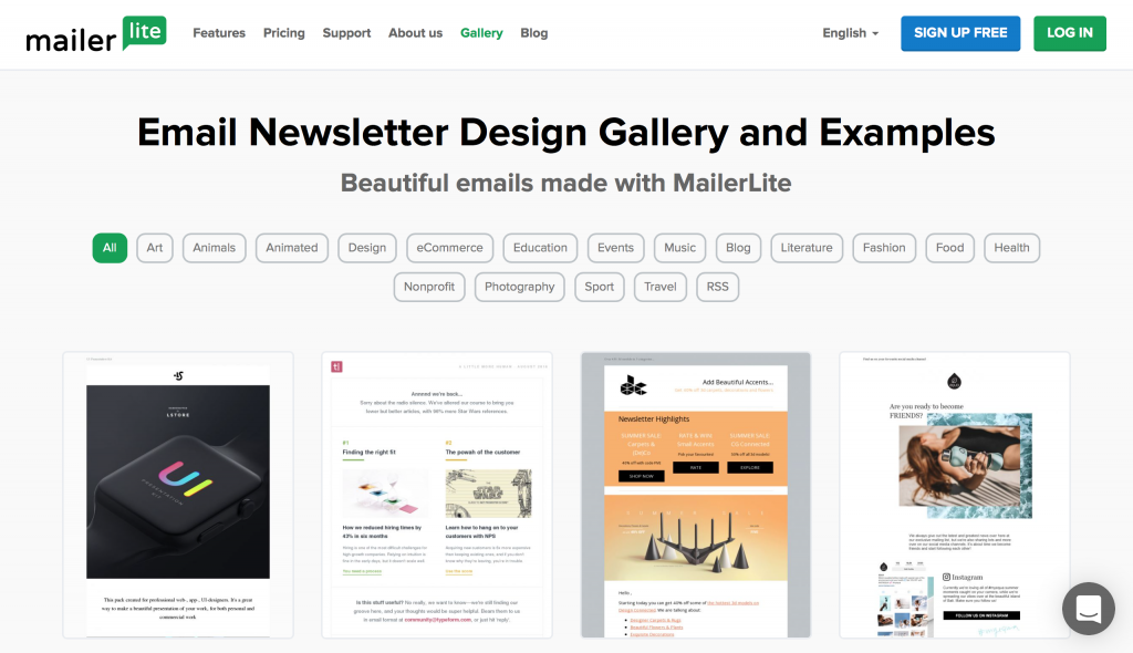
Mailerlite.com offers a variety of email templates for email marketing campaign
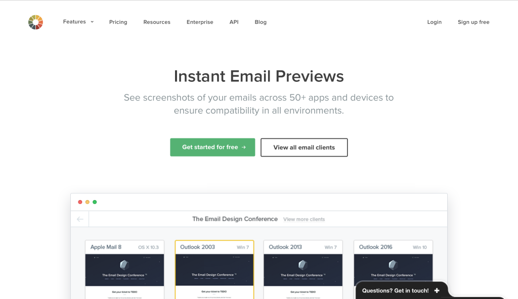
Instant email Previews from Litmus offers a tool to test your email layouts and preview them before sending your emails to your costumers.
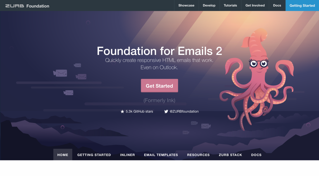
You can also use Responsive from Zurb. It is a a responsive email boilerplate. It helps creates emails that work on any device and client, even Outlook.


