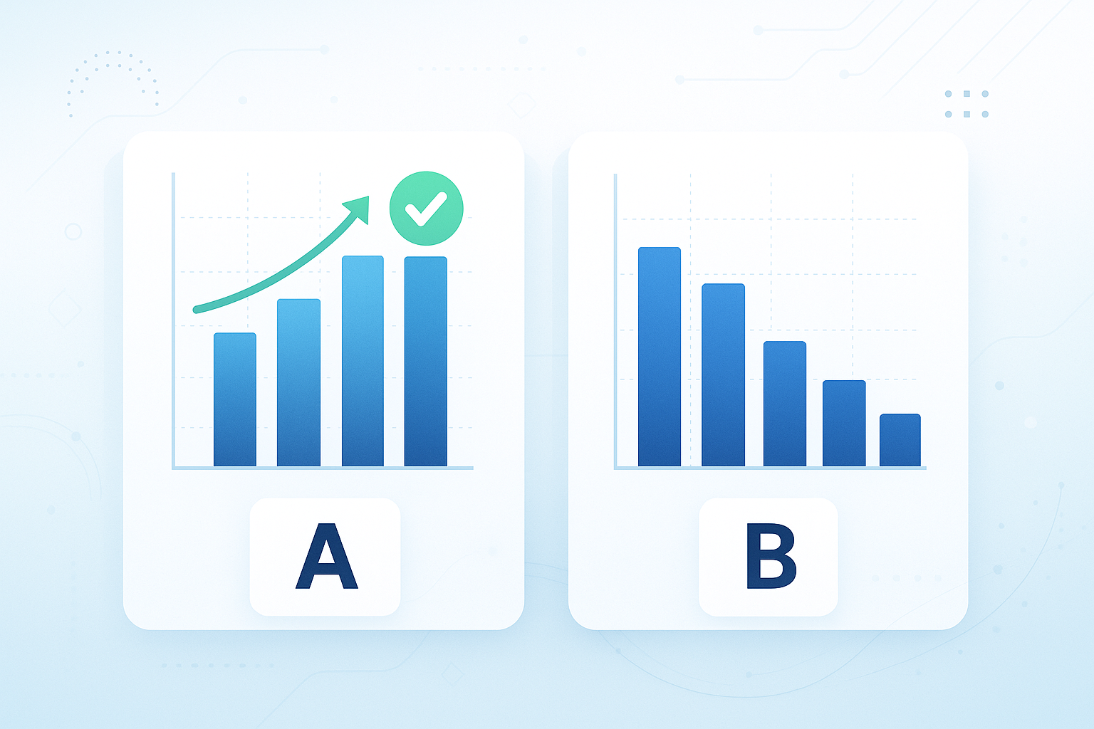
Clear charts make A/B test results easy to understand and act on. They help you compare variants, spot trends, and communicate findings effectively. Here’s how to get started:
-
Prepare Your Data:
- Collect clean, organized data (e.g., conversion rates, user behavior).
- Remove duplicates, validate email addresses, and standardize formats.
-
Choose the Right Charts:
- Bar Charts: Compare performance (e.g., conversion rates).
- Line Charts: Track trends over time.
- Funnel Charts: Show user progression through stages.
- Histogram Charts: Analyze response distribution.
-
Design Effective Charts:
- Use clear labels, titles, and annotations.
- Keep visuals consistent with colors (e.g., blue for control, green for winners).
- Include confidence intervals, sample sizes, and p-values for credibility.
-
Present Results Clearly:
- Summarize data in tables showing metrics, changes, and statistical confidence.
- Tie results to business goals and suggest actionable next steps.
Quick Comparison
| Chart Type | Best For | Example Metrics |
|---|---|---|
| Bar Charts | Comparing group performance | Conversion rates, KPIs |
| Line Charts | Tracking trends over time | Time-based changes |
| Funnel Charts | Mapping user progression | Conversion flow stages |
| Histogram Charts | Analyzing response distribution | Spread of responses |
Start with clean data, pick the right chart, and present insights clearly to make better decisions faster.
How to visualize an adhoc A-B test in Tableau

Getting Your Data Ready for Charts
Before creating visualizations, make sure your A/B test data is clean and organized. Reliable insights depend on high-quality data.
Collecting Reliable Test Data
Focus on collecting data that aligns with your goals. Key metrics to consider include:
- Conversion metrics: Open rates, click-through rates, and goal completions
- User behavior data: Time spent on a page, scroll depth, and interaction patterns
- Delivery metrics: Email delivery status
- Segmentation data: User demographics, device types, and geographic locations
Use tracking systems that assign unique parameters to each test variant. This helps avoid mixing up data. Once you’ve gathered the data, validate and standardize it to ensure everything is consistent.
Cleaning and Validating Your Data
Keep your test results accurate by thoroughly cleaning and validating your data:
Start by cleaning your email lists to ensure accurate delivery tracking. Marketing Executive Ashima S. shares, "Bounceless is effective! It Enhanced our deliverability by having a very affordable cost. Overall, this was really worth our time."
2. Data Quality Checks
Verify your data by doing the following:
- Remove duplicate entries to avoid skewed results
- Check that email addresses follow proper syntax
- Use SMTP validation to confirm domain and mailbox existence
- Identify and eliminate spam traps that could impact delivery
3. Standardizing Data
Ensure consistency in your data by:
- Converting all timestamps to a single time zone
- Normalizing numerical values to the same scale
- Applying consistent naming conventions for variables
- Formatting dates uniformly (e.g., MM/DD/YYYY for the U.S.)
To maintain high data quality throughout your testing, connect your verification tools directly to your marketing platforms. This integration automates data cleaning, reduces errors, and ensures your charts and visualizations are based on accurate, reliable information.
Choosing the Right Charts for Your Tests
Once your data is ready, selecting the right chart is crucial for uncovering trends and patterns. Use chart types that highlight the most important insights in your data.
Bar Charts: Comparing Group Performance
Bar charts are ideal for comparing how different test groups perform. They're great for visualizing metrics like conversion rates and other key performance indicators (KPIs).
Line Charts: Tracking Trends Over Time
Line charts are perfect for showing how metrics change over time. While bar and line charts are useful for comparisons and trends, other chart types, like funnel and histogram charts, focus more on user behavior.
Funnel and Histogram Charts: Understanding User Behavior
- Funnel charts: These show how users progress through different stages, helping you pinpoint where drop-offs occur.
- Histogram charts: These analyze how user responses are distributed, offering insights into patterns or anomalies.
| Chart Type | Best For | Key Metrics |
|---|---|---|
| Bar Charts | Comparing group performance | Conversion rates, KPIs |
| Line Charts | Showing changes over time | Trends across time periods |
| Funnel Charts | Mapping user progression | Conversion flow through stages |
| Histogram Charts | Examining response distribution | Spread and frequency of responses |
Once you've selected the right chart, focus on refining it to make your data clear and impactful.
Building Easy-to-Read Charts
Make your charts clear and impactful. A well-designed chart allows stakeholders to grasp A/B test results quickly and make informed decisions.
Adding Clear Labels and Notes
Use labels that are descriptive and informative:
- Titles: Clearly state the test's purpose and timeframe.
- Axis labels: Include units of measurement for better understanding.
- Data labels: Show exact values for precision.
- Annotations: Highlight key findings or unusual data points.
For example, instead of a vague title like "Conversion Rate", opt for something more specific: "Homepage Sign-up Conversion Rate (Apr 1-28, 2025)." This gives immediate context about what’s being measured and when.
Setting Up Consistent Visuals
Consistency in design makes your charts look professional and easier to interpret. Follow these guidelines:
| Element | Guideline | Purpose |
|---|---|---|
| Colors | Use blue (#007AFF) for control, green (#34C759) for winners | Helps viewers quickly identify groups |
| Fonts | Limit to 2-3 standard fonts like Arial or Helvetica | Keeps text readable |
| Size | Keep chart width between 600-800 pixels | Ensures visibility in presentations |
| Spacing | Add 20-30 pixels of padding between elements | Enhances visual clarity |
Showing Statistical Confidence
Include critical elements to back up your data:
- Add error bars, 95% confidence intervals, sample sizes, and p-values when relevant.
When showing confidence intervals, use clear visuals. For instance, if the control group has a 10% conversion rate with a 95% confidence interval, display it as "10% ± 1.2%", with a light gray band around the data point for emphasis.
Next, we’ll explore how to interpret these polished visuals to drive better decisions.
Reading and Sharing Test Results
Effectively communicate your findings to stakeholders by presenting clear data and actionable insights.
Creating Results Tables
Turn chart data into easy-to-read summary tables like this:
| Metric | Control | Variant A | Change | Confidence |
|---|---|---|---|---|
| Conversion Rate | 4.2% | 5.1% | +21.4% | 95% |
| Sample Size | 10,000 | 10,000 | - | - |
| p-value | - | 0.032 | - | - |
When designing your table:
- Round percentages to one decimal place for simplicity.
- Include sample sizes to show the validity of your test.
- Highlight percentage changes for clarity.
- Add statistical significance details to build trust in the data.
These tables help you tell a clear story and make the data easier to act on.
Building a Data Narrative
Turn raw data into practical recommendations:
1. Start with the main goal
Begin by explaining the test's purpose and hypothesis. For example: "We tested two homepage designs to boost sign-ups, hypothesizing that moving the form above the fold would lead to more submissions."
2. Tie data to business outcomes
Translate percentage changes into real-world impact. For instance: "A 21.4% increase in the conversion rate could mean an extra 900 sign-ups per month, based on current traffic."
3. Simplify statistical significance
Use straightforward language to explain reliability: "With 95% confidence and a p-value of 0.032, we can trust that Variant A's improvement isn’t just random."
4. Offer clear next steps
- Specify the changes to implement.
- Highlight which audience segments responded best.
- Suggest follow-up tests to refine results further.
Support your recommendations with visuals from your charts to make them more compelling.
When presenting results through email or slides, include both the summary table and visual charts. This allows stakeholders to quickly grasp the key points while having access to detailed data for deeper understanding.
Conclusion: Using Charts to Drive Decisions
Every part of the process, from cleaning up data to picking the right charts, plays a role in success. Using the techniques outlined earlier, incorporating clear and straightforward visuals can make a big difference. Well-designed charts help transform raw A/B test results into insights you can act on.
Clear visuals make it easier to spot patterns and simplify complex statistics, ensuring everyone on the team can make informed decisions.
"Great tool to validate emails. Works pretty fast and provides great statistics and graphs."
What matters most:
- Clarity in visuals: Keep formatting consistent and labels clear to make information easy to grasp.
- Confidence in data: Show confidence levels and sample sizes to back up your results.
- Relevance to goals: Tie visuals directly to important metrics and business objectives.
Use these tips to keep improving your A/B testing strategy over time.
FAQs
How can I make sure my A/B test data is accurate and ready for visualization?
To ensure your A/B test data is accurate and reliable before creating visualizations, it's crucial to clean and validate the data. One effective way to do this is by verifying your email lists to remove invalid, duplicate, or risky addresses. This ensures you're working with high-quality data and targeting an engaged audience, which leads to more meaningful and trustworthy A/B test results.
By taking these steps, you can confidently create visualizations that reflect actionable insights and support better decision-making.
What should be included in charts to clearly present A/B test results to stakeholders?
To clearly present A/B test results, charts should include key metrics like conversion rates, confidence intervals, and sample sizes. Use visual elements such as bar graphs, line charts, or pie charts to make comparisons easy to understand. Ensure all charts are labeled properly with titles, axis labels, and legends to provide context.
Focusing on clarity and simplicity will help stakeholders quickly interpret results and make informed decisions based on the data.
What is the best way to choose the right chart type for visualizing A/B test results?
Choosing the right chart type depends on the type of data and the insights you want to highlight. For comparing two groups, bar charts or column charts are ideal as they clearly show differences in metrics like conversion rates. If you're analyzing trends over time, consider using a line chart to display changes and patterns effectively.
For more complex datasets, scatter plots can help visualize relationships between variables, while pie charts work well for showing proportions or percentages. Always ensure your chosen chart type aligns with your specific data and the story you want to convey for better decision-making.

